
Brand Learning Paths
- Applies to:
- MindTouch (current)
- Role required:
- Admin
- Customize a path icon in a guide tab with an icon font
- Customize a path icon in a page with a background image
- Customize an icon on a page in a path
- Customize a progress bar in a path
Prerequisites
- At least one Learning Path created
- Advanced CSS and HTML knowledge
- Browser developer tools
- Location to host images
- Access to the control panel for adding in custom CSS to a site.
Customize a path icon in a guide tab with an icon font
Most content authors want to make their paths easier to identify. One way of doing so is to customize the icon or image used when displaying a path on a page. CXone Expert has a list of available icons that can be used to uniquely identify your individual paths.
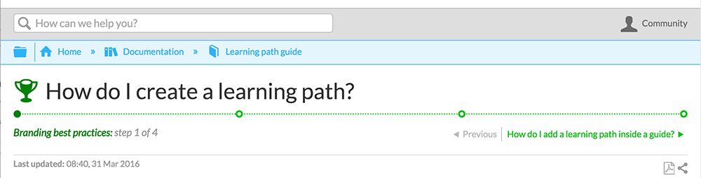
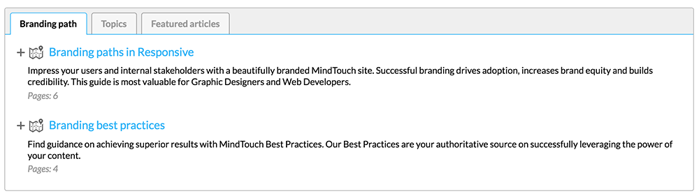
- Let's start off with the default display of a path:
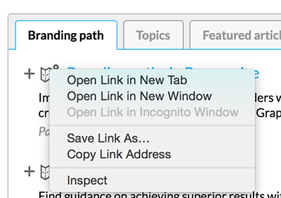
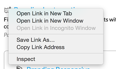
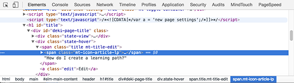
- Hover over the icon next to the path you want to customize.
- Right-click the icon and select Inspect to trigger your browser's developer tools.
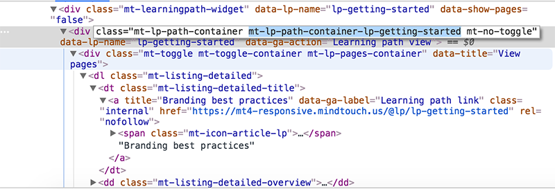
- In the developer tool, the
<span class="mt-icon-article-lp">element inside your path container is automatically selected. - Scroll up in the DOM (document object model), until you see a
<div>with the classmt-lp-path-container.
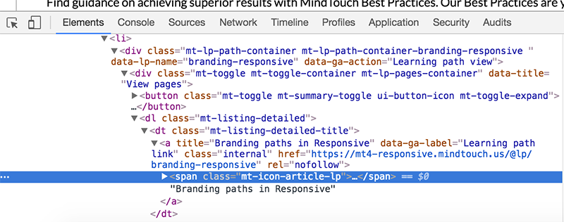
- To the right of the class
mt-lp-path-container, you will find the unique class name assigned to your path. This unique path class name starts withmt-lp-path-container-[path name]. In the below example, the unique path name ismt-lp-path-container-branding-responsive.
- Use the above-identified unique path class name as a CSS selector to target the span tag's
:beforepseudo element using CSS..mt-lp-path-container-branding-responsive .mt-icon-article-lp:before { content: '\e863'; } - Here is an example of custom icons being used.
Now that you have mastered how to customize a path in a guide tab, it should be much easier to customize additional elements in that same path.
Customize a path icon in a page with a background image
Follow these easy steps to customize the path icon found outside of guide tabs with an image instead of an icon font. Once you've mastered this type of customization, it will be much easier to customize other elements in a path.
- Navigate to the page where your path is displayed.
- Hover over the path icon, right-click it and select Inspect.
- In your browser's developer tools, you will notice the
<span>element with a class ofmt-icon-article-lp. Remember this class; it will be used as a CSS selector for your custom image later.
- Scroll up in the DOM until you reach a
<div>with the classmt-lp-path-container. To the right of this class name, you will see a custom class that is unique to your path. It will start withmt-lp-path-container-[path name].
- Combine this custom class name with the previous class name
mt-icon-article-lpas a CSS selector for your custom image. - Neutralize the default path's icon font ruleset by using the following CSS:
.mt-lp-path-container-lp-getting-started .mt-icon-article-lp:before {
    content: '';
}
- Next, declare a background image for the
<span class="mt-icon-article-lp">element you first selected. You will need to have your custom image hosted somewhere; for now we will use an article attachment. Be sure to set the height and width for your image, or you will not be able to see it.
.mt-lp-path-container-lp-getting-started .mt-listing-detailed-title span {
    background: url('/@api/deki/files/715/best-practices.svg') no-repeat 0 0;
    height: 1.15em;
    width: 1.15em;
}
- If you want to use this custom image ruleset in a guide tab, you will need to add an additional selector to override the original default ruleset.
.mt-lp-listings .mt-lp-path-container-lp-getting-started .mt-listing-detailed-title span {
    background: url('/@api/deki/files/715/best-practices.svg') no-repeat 0 0;
    height: 1.15em;
    width: 1.15em;
}
- Here is an example of a custom background image used for a path.
Customize an icon on a page in a path
You can continue your path customization on the pages in your path as well. Adding a custom icon or image allows you to carry your custom theme forward.
Follow these steps to customize the path icon that appears for each page along the path:
- Go to any page of your path.
- Hover over the icon in the page title, right-click it and select Inspect.
- Your browser's dev tools will open to the
<span>used for the path icon.
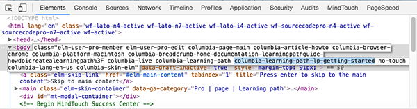
- To find the custom class used for this path, scroll up in the DOM until you come to the
<body>element. Look for the class name that starts withcolumbia-learning-path-[path name]. In our example, the class iscolumbia-learning-path-lp-getting-started. You will need this class as a CSS selector to target pages along the path.
- Use this class name as a CSS selector to target the span tag's
:beforepseudo element. Here is a list of available icons that can be used to customize the path's icon.
.columbia-learning-path-lp-getting-started #title .mt-icon-article-lp:before {
    content: '\e83f';
}
- Here is an example of how the updated icon would look along a path.
Customize a progress bar in a path
Sometimes the best way to customize a path is with color. Here are some easy ways to make each path unique.
- Go to any page of your path.
- Hover over any element you wish to customize in the progress bar, right-click the element and select Inspect.
- Once your browser's developer tools are open, find the custom class used for this path by scrolling up in the DOM until you come to the
<body>element. Look for the class name that starts withcolumbia-learning-path-[path name]. In our example, the class iscolumbia-learning-path-lp-getting-started. You will need this class as a CSS selector to target pages along the path.
- Use this class name as a CSS selector in front of all CSS rule sets you use to customize this progress bar. In our example, we look at the color of the progress bar indicators.
- Use the right-click > Inspect action to target the indicator element so it is easier to find. For this example, we skip ahead to the actual element on the page.
- The color of the indicator is created with a border style on the
:beforepseudo element of the<span class="mt-icon-progress-indicator">found inside the page's link. Changing the color of that border would look like this:
.columbia-learning-path-lp-getting-started .mt-lp-progress-bar li a span:before {
    border: .25em solid #0fc119;
}
- Now that you know how to find each element you want to change and how to add the path's unique CSS selector, you can style your path's progress bar anyway you'd like. Here's a quick example of some of the elements you can change:
/* path icon */
.columbia-learning-path-lp-getting-started #title .mt-icon-article-lp:before {
    color: #03820a;
}

/* current page indicator */
.columbia-learning-path-lp-getting-started .mt-lp-progress-bar .mt-lp-page-current a span:before {
    background: #03820a;
    border: .25em solid #03820a;
}

/* progress indicators */
.columbia-learning-path-lp-getting-started .mt-lp-progress-bar li a span:before {
    border: .25em solid #0fc119;
}

/* progress bar line */
.columbia-learning-path-lp-getting-started .mt-lp-progress-bar {
    border-top: .15em dotted #3ad243;
}

/* path title below progress bar */
.columbia-learning-path-lp-getting-started .mt-lp-path-title-display {
    color: #03820a;
}

/* previous and next links */
.columbia-learning-path-lp-getting-started .mt-article-pagination a {
    color: #0fc119;
}
.columbia-learning-path-lp-getting-started .mt-article-pagination a:hover,
.columbia-learning-path-lp-getting-started .mt-article-pagination a:focus,
.columbia-learning-path-lp-getting-started .mt-article-pagination a:active {
    color: #03820a;
}