
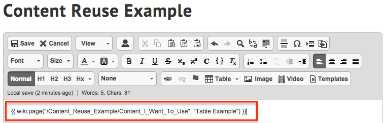
Visual element variables
- Applies to:
- MindTouch (current)
- Role required:
- N/A
Border radius
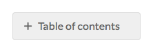
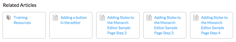
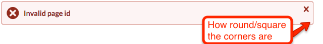
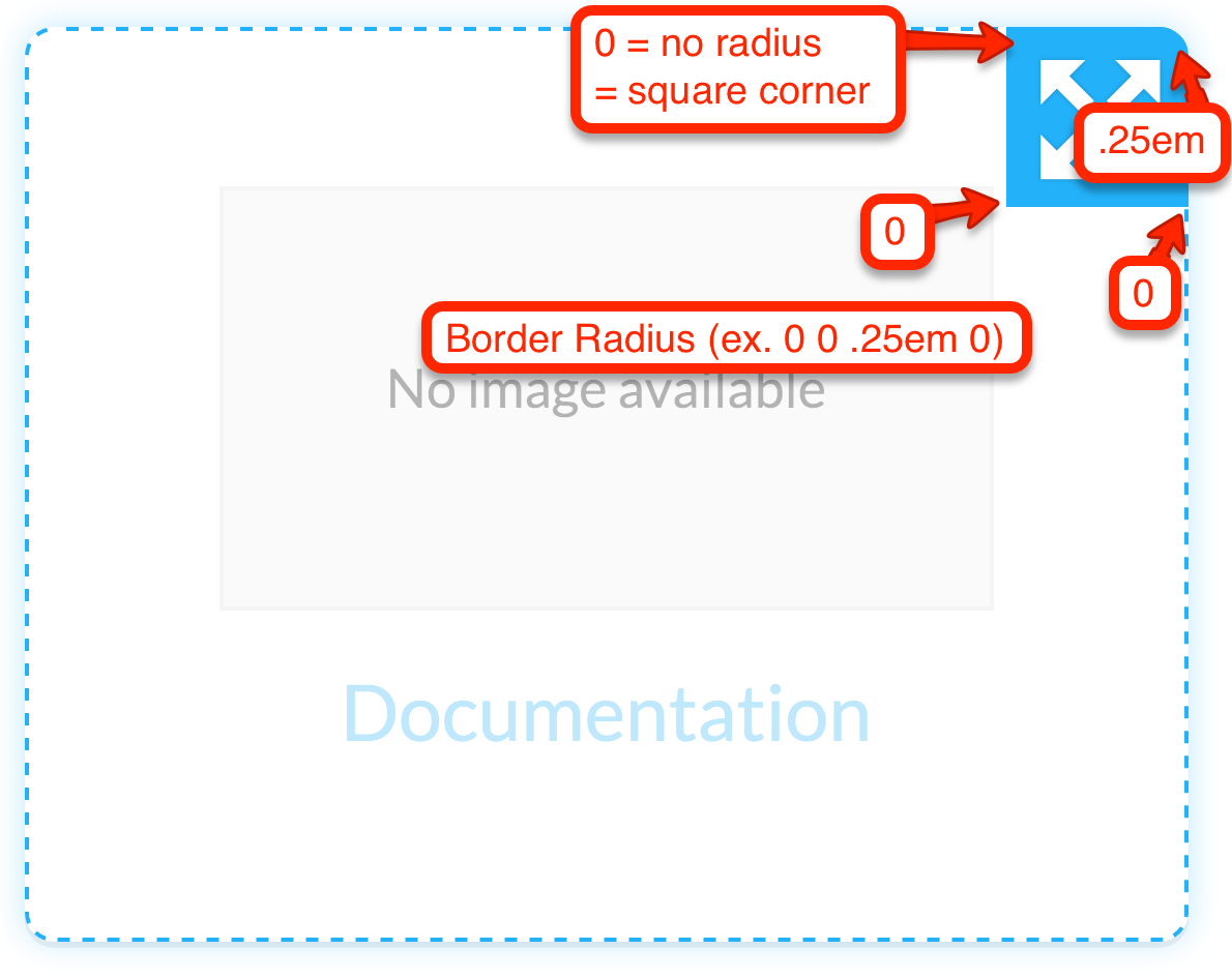
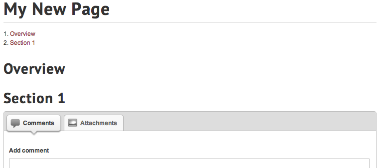
Otherwise know as rounded corners, border radius is applied to many different containers in the Responsive skin. There are two types of border radius variables; one for small corners and one for medium sized corners. Small borders can be seen in the "Table of contents" and Search Report filters. Medium sized rounded corners can be seen in dynamic listings (found on Portfolios and Categories) and "Related Articles".
Screenshots
Variables
- @border-radius-default
- Default value: .25em
- Definition: The default border radius applied to tabbed containers, content containers, and messaging to name a few. Value is set to 1/4th of the containers font size.
- @border-radius-lsf
- Default value: .5em
- Definition: The border radius used in dynamic listings, dialogs, and some banners. Value is set to 1/2 of the containers font size.
CSS
Here is an example of how these variables would be used in a rule set.
// Default border radius
.ui-progressbar {
    border: 1px solid @highlight-container-border-color;
    border-radius: @border-radius-default;
    height: 2em;
    overflow: hidden;
    position: relative;
    text-align: left;
}

// Dynamic listings border radius
#link-picker-tree {
    border: 1px solid @primary-container-border-color;
    border-radius: @border-radius-lsf;
    height: 16.5em;
    overflow: auto;
    padding: 1em;
}
Box shadows
An inner box shadow is applied to inputs, text areas, and buttons when a user clicks on them.
Screenshots
Variables
- @box-shadow-inner
- Default value: inset .1em .1em .4em rgba(0,0,0,.15)
- Definition: This inner shadow is used when a form element such as a textarea or input field is clicked in.
(Note - image above zoomed in significantly)
CSS
Here is an example of how this variable would be used in a rule set.
textarea:active,
textarea:focus {
    border: 1px solid @highlight-color;
    box-shadow: @box-shadow-inner;
    outline: 0;
}
Disabled styles
Interactive elements in the Responsive skin such as buttons, links, and form elements all have a disabled state. This state is set by a disabled attribute in the HTML and a disabled class name.
Screenshots


Variables
- @disabled-background
- Default value: lighten(@highlight-color-desaturated, 35%)
- Definition: The background color applied to disabled buttons and form elements.
- @disabled-border-color
- Default value: lighten(@highlight-color-desaturated, 20%)
- Definition: The border color applied to disabled buttons and form elements.
- @disabled-link-color
- Default value: lighten(@highlight-color-desaturated, 15%)
- Definition: The text color of disabled links, buttons, and form elements.
CSS
Here is an example of how these variables would be used in a rule set.
.mt-disabled:active,
.mt-disabled:focus {
    background: @disabled-background !important;
    border: 1px solid @disabled-border-color !important;
    box-shadow: none !important;
    color: @disabled-link-color !important;
    cursor: default !important;
}
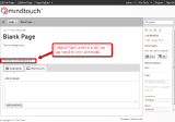
Edit controls
These elements control editor level functionality in regards to page settings, dynamic listings, and guide tabs.
Screenshots
Variables
- @edit-controls-background-color
- Default value: @background
- Definition: The background color of the edit control container.
- @edit-controls-background-color-hover
- Default value: @highlight-color
- Definition: The background color of the edit control container when a user moves their mouse over it.
- @edit-controls-border-color
- Default value: @highlight-color
- Definition: The border color of the edit control container.
- @edit-controls-border-color-hover
- Default value: @highlight-color
- Definition: The border color of the edit control container when a user moves their mouse over it.

- @edit-controls-border-radius
- Default value: 0 0 @border-radius-default 0
- Definition: The rounded corners of the edit control container.
- @edit-controls-text-color
- Default value: @highlight-color
- Definition: The color of the edit control icon.

- @edit-controls-text-color-hover
- Default value: contrast(@highlight-color)
- Definition: The color of the edit control icon when a user moves their mouse over it.

CSS
Here is an example of how these variables would be used in a rule set.
.mt-edit-control {
    background: @edit-controls-background-color;
    border: 1px dashed @edit-controls-border-color;
    border-radius: 0 @border-radius-default 0 0;
    color: @edit-controls-text-color;
    cursor: pointer;
    display: none;
    float: right;
    font-size: 200%;
    height: 1.5em;
    line-height: 1;
    margin: 0 0 -2em -2em;
    overflow: hidden;
    padding: .25em;
    position: relative;
    text-align: center;
    text-indent: -9999px;
    white-space: nowrap;
    width: 1.5em;
    z-index: 9;
}
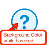
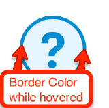
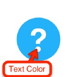
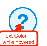
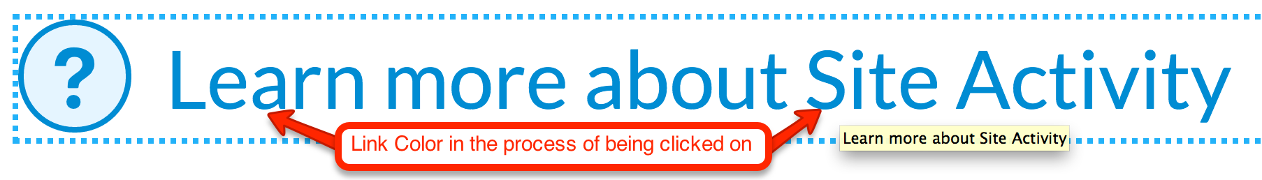
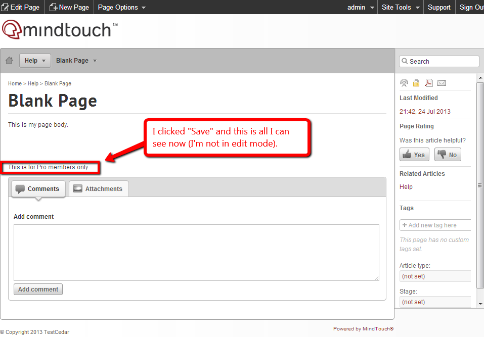
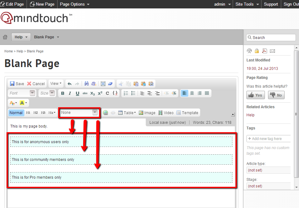
Contextual help icons
You will find F1 help links throughout the Responsive skin. Viewable by pro members only, these links trigger an F1 dialog and display additional help information about the functionality associated with it.
Screenshots
Variables
- @f1-icon-background-color
- Default value: @highlight-color
- Definition: The background color of the F1 icon circle.
- @f1-icon-background-color-hover
- Default value: lighten(@highlight-color, 37%)
- Definition: The background color of the F1 icon circle when a user moves their mouse over it.
- @f1-icon-border-color
- Default value: @highlight-color
- Definition: The border color of the F1 icon circle.

- @fi-icon-border-color-hover
- Default value: darken(@f1-link-color, 15%)
- Definition: The border color of the F1 icon circle when a user moves their mouse over it.
- @f1-icon-text-color
- Default value: contrast(@highlight-color)
- Definition: The icon color of an F1 link.
- @f1-icon-text-color-hover
- Default value: darken(@f1-link-color, 15%)
- Definition: The icon color of an F1 link when a user moves their mouse over it.
- @f1-link-color
- Default value: @highlight-color
- Definition: The text color of an F1 link when text is visible.

- @f1-link-color-visited
- Default value: @highlight-color
- Definition: The text color of an F1 link when a user has previously clicked on it.
.png?revision=1)
- @f1-link-color-hover
- Default value: darken(@f1-link-color, 15%)
- Definition: The text color of an F1 link when a user moves their mouse over it.
- @f1-link-color-active
- Default value: darken(@f1-link-color, 15%)
- Definition: The text color of an F1 link when a user clicks the link or hits enter after tabbing to it with their keyboard.
- @f1-link-color-focus
- Default value: darken(@f1-link-color, 15%)
- Definition: The text color of an F1 link when a user has tabbed to it with their keyboard.

CSS
Here is an example of how these variables would be used in a rule set.
// This is the F1 icon in its hover state
.no-touch .mt-icon-f1-link:hover:before,
.no-touch .ui-widget-content .mt-icon-f1-link:hover:before,
.no-touch .ui-widget-content .mt-f1-link:hover .mt-icon-f1-link:before {
    background: @f1-icon-background-color-hover;
    border-color: @fi-icon-border-color-hover;
    color: @f1-icon-text-color-hover;
}
Note: The .no-touch selector is used for all hover pseudo elements because of :hover conflicts with certain touch screen devices.
Status messages
Expert uses messaging to communicate important information about the outcome of certain functionalities. There are five different styles of status message: error, success, warning, info, and pro-member warning.
Error message

Variables
- @error-message-background-color
- Default value: #FDF4F4
- Definition: The background color of the error message container.

- @error-message-border-color
- Default value: #CB7064
- Definition: The border color of the error message container.

- @error-message-font-color
- Default value: #912B1D
- Definition: The text color inside the error message container.
.png?revision=1)
- @error-message-icon-color
- Default value: #912B1D
- Definition: The icon color inside the error message container.

Mixin
.error-message {
    background: @error-message-background-color;
    border: 1px solid @error-message-border-color;
    color: @error-message-font-color;
}
CSS
Here is an example of how these variables and mixin are used in rule sets.
// The error message container
.errormsg {
    .error-message;
}

// The error message delete button
.errormsg .delete-msg {
    color: @error-message-icon-color;
}

// The error message icon found on the left side of the container
.errormsg .inner:before {
    color: @error-message-icon-color;
    content: '\e891';
}
Success message
Variables
- @success-message-background-color
- Default value: #F5FCF6
- Definition: The background color of the success message container.

- @success-message-border-color
- Default value: #1EA824
- Definition: The border color of the success message container.

- @success-message-font-color
- Default value: #287733
- Definition: The text color inside the success message container.
.png?revision=1)
- @success-message-icon-color
- Default value: #1EA824
- Definition: The icon color inside the success message container.

Mixin
.success-message {
    background: @success-message-background-color;
    border: 1px solid @success-message-border-color;
    color: @success-message-font-color;
}
CSS
Here is an example of how these variables and mixin are used in rule sets.
// The success message container
.successmsg {
    .success-message;
}

// The success message delete button
.successmsg .delete-msg {
    color: @success-message-icon-color;
}

// The success message icon found on the left side of the container
.successmsg .inner:before {
    color: @success-message-icon-color;
    content: '\e6fc';
}
Warning or upgrade message

Variables
- @upgrade-warn-message-background-color
- Default value: #FDF7EC
- Definition: The background color of the warning/upgrade message container.

- @upgrade-warn-message-border-color
- Default value: #DB4D05
- Definition: The border color of the warning/upgrade message container.
- @upgrade-warn-message-font-color
- Default value: #C06800
- Definition: The text color inside the warning/upgrade message container.
.png?revision=1)
- @upgrade-warn-message-icon-color
- Default value: #DB4D05
- Definition: The icon color inside the warning/upgrade message container.

Mixin
.upgrade-warn-message {
    background: @upgrade-warn-message-background-color;
    border: 1px solid @upgrade-warn-message-border-color;
    color: @upgrade-warn-message-font-color;
}
CSS
Here is an example of how these variables and mixin are used in rule sets.
// The warning message container
.upgrade,
.warningmsg {
    .upgrade-warn-message;
}

// The warning message delete button
.upgrade .delete-msg,
.warningmsg .delete-msg {
    color: @upgrade-warn-message-icon-color;
}

// The warning message icon found on the left side of the container
.upgrade .inner:before,
.warningmsg .inner:before {
    color: @upgrade-warn-message-icon-color;
    content: '\e89a';
}
Informational message
Variables
- @system-info-message-background-color
- Default value: #EEF9FF
- Definition: The background color of the informational message container.

- @system-info-message-border-color
- Default value: #30b3f6
- Definition: The border color of the informational message container.

- @system-info-message-font-color
- Default value: #0597E2
- Definition: The text color inside the informational message container.
.png?revision=1)
- @system-info-message-icon-color
- Default value: #30b3f6
- Definition: The icon color inside the informational message container.
Mixin
.system-info-message {
    background: @system-info-message-background-color;
    border: 1px solid @system-info-message-border-color;
    color: @system-info-message-font-color;
}
CSS
Here is an example of how these variables and mixin are used in rule sets.
// The informational message container
.infomsg {
    .system-info-message;
}

// The informational message delete button
.infomsg .delete-msg {
    color: @system-info-message-icon-color;
}

// The informational message icon found on the left side of the container
.infomsg .inner:before {
    color: @system-info-message-icon-color;
    content: '\e897';
}
Seated member warning messages

Variables
- @mt-banner-background-color
- Default value: @error-message-background-color
- Definition:

- @mt-banner-border-color
- Default value: @error-message-border-color
- Definition:
- @mt-banner-font-color
- Default value: @error-message-font-color
- Definition:
Mixin
.mt-banner-message {
    background: @mt-banner-background-color;
    border-bottom: 1px solid @mt-banner-border-color;
    color: @mt-banner-font-color;
}
CSS
Here is an example of how the pro-member warning banner would be used in a rule set.
.mt-banner {
    .mt-banner-message;
    font-size: 100%;
    font-weight: bold;
    padding: 1em;
    text-align: center;
}
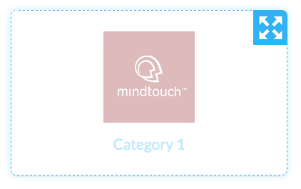
Dynamic listings
Displaying a list of sub-pages, related pages, or search results filters these dynamic containers are found throughout the site. Their minimalistic design consists of a simple rounded grey border with a highlight color glow on hover and is meant to showcase the content within.
Basic container styling
The variables associated with these containers not only control the style, but the ability to resize to their environment. This means that if the screen size shrinks down, the listings will shrink or grow and change their row count automatically.
// Basic dynamic listing style variables
@dynamic-listing-border-color: lighten(@highlight-color-desaturated, 13%);
@dynamic-listing-border-color-hover: @highlight-color;
@dynamic-listing-edit-border-color: darken(@highlight-color-desaturated, 18%);
@dynamic-listing-edit-border-color-hover: @highlight-color;
@dynamic-listing-hover-glow: fade(@default-button-border-color-hover, 30%);

// Basic dynamic listing mixins that control the above style variables
.flexbox-style {
    border: 1px solid @dynamic-listing-border-color;
    border-radius: @border-radius-lsf;
    box-sizing: border-box;
}
.flexbox-style-hover {
    border-color: @dynamic-listing-border-color-hover;
    box-shadow: 0 .1em 0 rgba(0,0,0,.05), 0 0 .8em @dynamic-listing-hover-glow;
}
.flexbox-style-edit {
    border: 1px dashed @dynamic-listing-edit-border-color;
    box-sizing: border-box;
}
.flexbox-style-edit-hover {
    border-color: @dynamic-listing-edit-border-color-hover;
    box-shadow: 0 .1em 0 rgba(0,0,0,.05), 0 0 .8em @dynamic-listing-hover-glow;
}
Advanced styling
For more advanced control over the flexibility of these dynamic listings, there are two advanced mixins that can be used. You will need experience with using media queries for different screen sizes. The first mixin, .display-flex is meant to be applied to the parent container the listings will be displayed in; usually an <ol> or <ul>. The second mixin .flexbox-listing is meant for the child elements or individual listings. The values that this mixin may contain have to do with the CSS3 specification for flexbox (CSS Flexible Box Layout) and require an advanced knowledge of CSS. For more information about flexbox please visit the specification page located at http://dev.w3.org/csswg/css-flexbox.
// Flex display mixin for parent container
.display-flex {
    .ms-flex-display;
    .webkit-flex-display;
    align-content: flex-start;
    align-items: stretch;
    display: -ms-flexbox;
    display: -webkit-flex;
    display: flex;
    flex-direction: row;
    flex-wrap: wrap;
    justify-content: flex-start;
}

// Flex display mixin for each listing
.flexbox-listing(@flex-grow: 1; @flex-shrink: 1; @flex-basis: 18em) {
    -ms-flex: @flex-grow @flex-shrink @flex-basis;
    -webkit-flex: @flex-grow @flex-shrink @flex-basis;
    flex: @flex-grow @flex-shrink @flex-basis;
    min-width: 0;
}
For more advanced branding of your site, learn more about using CSS and LESS to brand your site.