
Link variables
- Role required:
- N/A
There are a few ways to control how your links will look: through a variable, a mixin, or a class added to an element.
Links
The default link colors for a site are generated based off of the @highlight-color variable, but can be redefined using the following variables:
@primary-link-color: @highlight-color;
@primary-link-color-visited: @highlight-color;
@primary-link-color-hover: lighten(@highlight-color-desaturated, 13%);
@primary-link-color-active: lighten(@highlight-color-desaturated, 13%);
@primary-link-color-focus: lighten(@highlight-color-desaturated, 13%);
To change more than the default link colors, use the .mt-primary-link-style mixin to add additional declarations. The default code in Expert is:
.mt-primary-link-style {
    color: @primary-link-color;
    &:visited {
        color: @primary-link-color-visited;
    }
    .no-touch &:hover {
        color: @primary-link-color-hover;
    }
    &:active {
        color: @primary-link-color-active;
    }
    &:focus {
        color: @primary-link-color-focus;
        outline: @primary-link-color dotted 1px;
    }
}
Here is the same mixin redefined in the Custom Site CSS with an underline that appears on hover. You do not need to redefine the color declaration if you'd like to keep them. This mixin rule set will only add to the existing one.
.mt-primary-link-style {
    .no-touch &:hover {
        text-decoration: underline;
    }
}
The .no-touch class selector is used to define the :hover pseudo class for non-touch screen devices only since it is not required otherwise.
Primary links
Primary links, the most common links in your site that usually exist inside your content areas, use the @highlight-color variable to remain consistent with your the color theme.

Variables
- @primary-link-color
- Default value: @highlight-color
- Definition: The color of a link when the page has finished loading and the user has taken no action.

- @primary-link-color-visited
- Default value: @highlight-color
- Definition: The color of a link that has been previously clicked on.
- @primary-link-color-hover
- Default value: lighten(@highlight-color-desaturated, 13%)
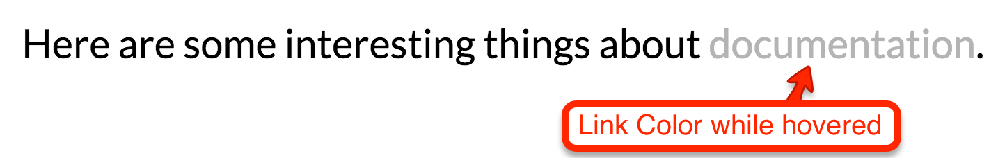
- Definition: The color of a link when the user moves their mouse over it.
- @primary-link-color-active
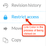
- Default value: lighten(@highlight-color-desaturated, 13%)
- Definition: The color of a link when the user clicks on it. Can also be seen when a user tabs with a keyboard to the link and then presses enter.
- @primary-link-color-focus
- Default value: lighten(@highlight-color-desaturated, 13%)
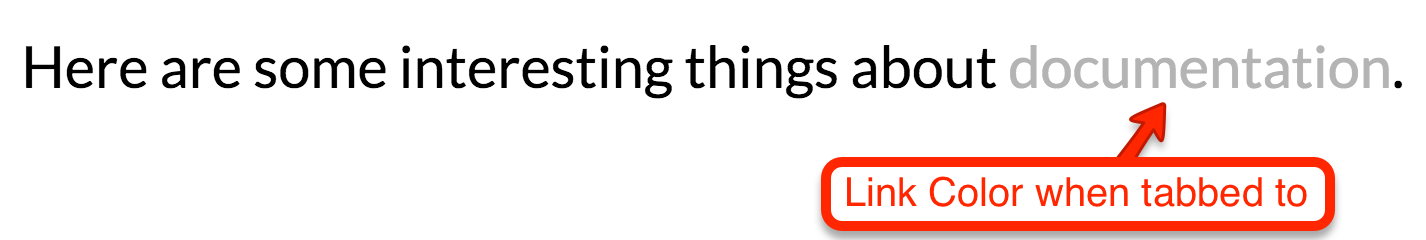
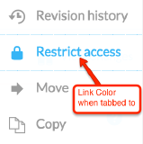
- Definition: The color of a link that has been tabbed to with a keyboard.
Mixins
This mixin will generate all of the pseudo classes that go along with your links.
.mt-primary-link-style {
    color: @primary-link-color;
    &:visited {
        color: @primary-link-color-visited;
    }
    .no-touch &:hover {
        color: @primary-link-color-hover;
    }
    &:active {
        color: @primary-link-color-active;
    }
    &:focus {
        color: @primary-link-color-focus;
        outline: @primary-link-color dotted 1px;
    }
}
CSS class
There is a CSS class selector that can be used to call in the Mixin. You will need to add a class to your HTML for this to work.
// Example of adding the class "mt-primary-link" to a link in your HTML
<a class="mt-primary-link" href="http://mindtouch.com">www.mindtouch.com</a>
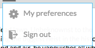
Secondary links
Secondary links, typically used for elements that do not need to stand out from their content, are used for Article Feedback buttons, drop-downs, select menus, and other secondary controls.

Variables
- @secondary-link-color
- Default value: lighten(@primary-font-color, 60%)
- Definition: The color of a link when the page has finished loading and the user has taken no action.
- @secondary-link-color-visited
- Default value: lighten(@primary-font-color, 60%)
- Definition: The color of a link that has been previously clicked on.
- @secondary-link-color-hover
- Default value: @highlight-color
- Definition: The color of a link when the user moves their mouse over it.
- @secondary-link-color-active
- Default value: @highlight-color
- Definition: The color of a link when the user clicks on it. Can also be seen when a user tabs with a keyboard to the link and then presses enter.
- @secondary-link-color-focus
- Default value: @highlight-color
- Definition: The color of a link that has been tabbed to with a keyboard.

Mixins
This mixin will generate all of the pseudo classes that go along with your links.
.mt-secondary-link-style {
    color: @secondary-link-color;
    &:visited {
        color: @secondary-link-color-visited;
    }
    .no-touch &:hover {
        color: @secondary-link-color-hover;
    }
    &:active {
        color: @secondary-link-color-active;
    }
    &:focus {
        color: @secondary-link-color-focus;
    }
}
CSS class
There is a CSS class selector that can be used to call in the Mixin. You will need to add a class to your HTML for this to work.
// Example of adding the class "mt-secondary-link" to a link in your HTML
<a class="mt-secondary-link" href="http://mindtouch.com">www.mindtouch.com</a>
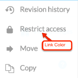
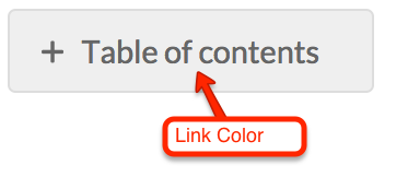
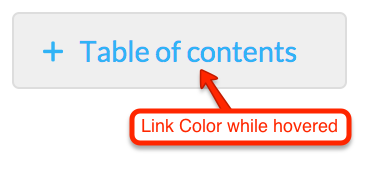
Tertiary links
Tertiary links, used least often, can be found in the TOC expand/collapse toggle, the page settings toggle, and a few admin-only features. By default, tertiary links have the least contract compared to surrounding text.
Variables
- @tertiary-link-color
- Default value:
- Definition: The color of a link when the page has finished loading and the user has taken no action.
- @tertiary-link-color-visited
- Default value:
- Definition: The color of a link that has been previously clicked on.

- @tertiary-link-color-hover
- Default value:
- Definition: The color of a link when the user moves their mouse over it.
- @tertiary-link-color-active
- Default value:
- Definition: The color of a link when the user clicks on it. Can also be seen when a user tabs with a keyboard to the link and then presses enter.

- @tertiary-link-color-focus
- Default value:
- Definition: The color of a link that has been tabbed to with a keyboard.


Mixins
This mixin will generate all of the pseudo classes that go along with your links.
.mt-tertiary-link-style {
    color: @tertiary-link-color;
    &:visited {
        color: @tertiary-link-color-visited;
    }
    .no-touch &:hover {
        color: @tertiary-link-color-hover;
    }
    &:active {
        color: @tertiary-link-color-active;
    }
    &:focus {
        color: @tertiary-link-color-focus;
    }
}
CSS class
There is a CSS class selector that can be used to call in the Mixin. You will need to add a class to your HTML for this to work.
// Example of adding the class "mt-tertiary-link" to a link in your HTML
<a class="mt-tertiary-link" href="http://mindtouch.com">www.mindtouch.com</a>
Underline hyperlinks within content
For links just within content areas (not navigation) to appear underlined, add the following code to custom CSS in the Control Panel:
/* underline content links */
.mt-content-container a {
    text-decoration: underline;
}
.mt-listing-detailed a,
.mt-listings-simple a,
.mt-sortable-listing a {
    text-decoration: none;
}