
Container variables
- Applies to:
- MindTouch (current)
- Role required:
- N/A
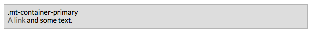
Primary containers
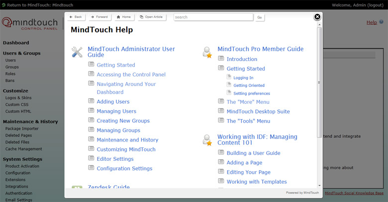
Primary containers are a medium gray with a slightly darker gray border. The user navigation bar is a good example of this container in use.
Variables
- @primary-container-background-color
- Default value: lighten(@highlight-color-desaturated, 29%)
- Definition: Background color of the container.
- @primary-container-border-color
- Default value: lighten(@highlight-color-desaturated, 13%)
- Definition: Border color of the container.
.png?revision=1)
- @primary-container-color
- Default value: @primary-font-color
- Definition: Default text color inside the container.
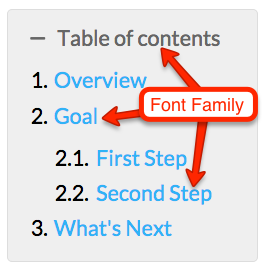
- @primary-container-font-family
- Default value: @default-font-family
- Definition: Default font face used in the container. Defaults to
<body>font.
.png?revision=1)
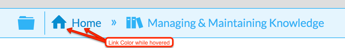
- @primary-container-link-color
- Default value: lighten(@primary-font-color-desaturated, 40%)
- Definition: The color of links inside the container on page load.
.png?revision=1)
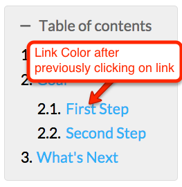
- @primary-container-link-color-visited
- Default value: @primary-container-link-color
- Definition: The color of links inside the container when a user has previously clicked on it.

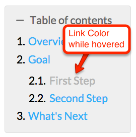
- @primary-container-link-color-hover
- Default value: @highlight-color
- Definition: The color of links inside the container when the user's mouse rolls over it.
- @primary-container-link-color-active
- Default value: @highlight-color
- Definition: The color of links inside the container when the user clicks on the link, or presses enter after tabbing to it.

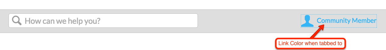
- @primary-container-link-color-focus
- Default value: @highlight-color
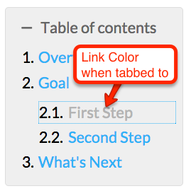
- Definition: The color of links inside the container when a user has tabbed to it with a keyboard.
Mixins
The primary container mixin will automatically generate CSS to style any links found inside it, including their pseudo classes. Notice that all of the previous variables are referenced in this mixin.
.mt-primary-container {
    background: @primary-container-background-color;
    border: 1px solid @primary-container-border-color;
    color: @primary-container-color;
    font-family: @primary-container-font-family;
    & a {
        color: @primary-container-link-color;
        &:visited {
            color: @primary-container-link-color-visited;
        }
        .no-touch &:hover {
            color: @primary-container-link-color-hover;
        }
        &:active,
        .no-touch &:active {
            color: @primary-container-link-color-active;
        }
        &:focus {
            color: @primary-container-link-color-focus;
        }
    }
}
This is how the above mixin will appear when used in a rule set.
.elm-header-user-nav {
    .mt-primary-container;
    border-width: 1px 0 0;
    position: static;
    text-align: left;
}
CSS class
There is a CSS class selector that can be used to call in the Mixin. You will need to add a class to your HTML for this to work.
// Example of adding the class "mt-container-primary" to a link in your HTML
<div class="mt-container-primary">My container content</div>
Secondary containers
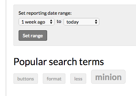
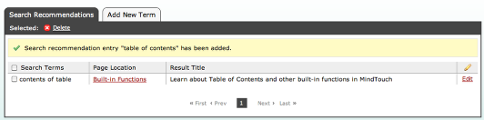
Secondary container styles are used in Table of contents, the footer, search terms, revision and site history headers, and page settings. They are a lighter gray with a slightly darker gray border.
Variables
- @secondary-container-background-color
- Default value: lighten(@highlight-color-desaturated, 36%)
- Definition: Background color of the container.
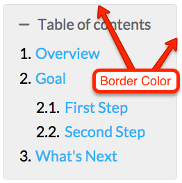
- @secondary-container-border-color
- Default value: lighten(@highlight-color-desaturated, 29%)
- Definition: Border color of the container.
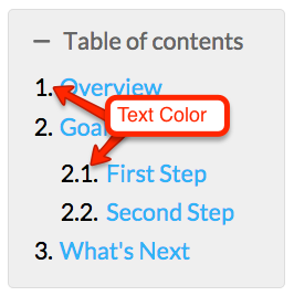
- @secondary-container-color
- Default value: @primary-font-color
- Definition: Default text color inside the container.
- @secondary-container-font-family
- Default value: @default-font-family
- Definition: Default font face used in the container. Defaults to
<body>font.
- @secondary-container-link-color
- Default value: @primary-link-color
- Definition: The color of links inside the container on page load.

- @secondary-container-link-color-visited
- Default value: @primary-link-color
- Definition: The color of links inside the container when a user has previously clicked on it.
- @secondary-container-link-color-hover
- Default value: @primary-link-color-hover
- Definition: The color of links inside the container when the user's mouse rolls over it.
- @secondary-container-link-color-active
- Default value: @primary-link-color-active
- Definition: The color of links inside the container when the user clicks on the link, or presses enter after tabbing to it.
- @secondary-container-link-color-focus
- Default value: @primary-link-color-focus
- Definition: The color of links inside the container when a user has tabbed to it with a keyboard.
Mixins
The secondary container mixin will automatically generate CSS to style any links found inside it, including their pseudo classes.
.mt-secondary-container {
    background: @secondary-container-background-color;
    border: 1px solid @secondary-container-border-color;
    color: @secondary-container-color;
    font-family: @secondary-container-font-family;
    & a {
        color: @secondary-container-link-color;
        &:visited {
            color: @secondary-container-link-color-visited;
        }
        .no-touch &:hover {
            color: @secondary-container-link-color-hover;
        }
        &:active,
        .no-touch &:active {
            color: @secondary-container-link-color-active;
        }
        &:focus {
            color: @secondary-container-link-color-focus;
        }
    }
}
This is how the above mixin will appear when used in a rule set.
.mt-toggle-container {
    .mt-secondary-container;
    border-radius: @border-radius-default;
    clear: both;
    margin: 0 0 1em;
    overflow: hidden;
    padding: .5em .8em .8em;
}
CSS class
There is a CSS class selector that can be used to call in the Mixin. You will need to add a class to your HTML for this to work.
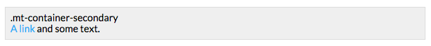
// Example of adding the class "mt-container-secondary" to a link in your HTML
<div class="mt-container-secondary">My container content</div>
Tertiary containers
There is only one instance of a tertiary container and that is in the pro-member view. The container is a dark grey, with a white border and white text.
Variables
- @tertiary-container-background-color
- Default value: darken(@highlight-color-desaturated, 38%)
- Definition: Background color of the container.

- @tertiary-container-border-color
- Default value: lighten(@highlight-color-desaturated, 100%)
- Definition: Border color of the container.
.png?revision=1)
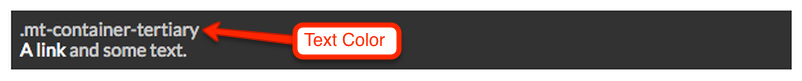
- @tertiary-container-color
- Default value: contrast(@tertiary-container-background-color, darken(@secondary-font-color, 10%), lighten(@quaternary-font-color, 20%))
- Definition: Default text color inside the container.
.png?revision=1)
- @tertiary-container-font-family
- Default value: @default-font-family
- Definition: Default font face used in the container. Defaults to
<body>font.

- @tertiary-container-link-color
- Default value: contrast(@tertiary-container-background-color)
- Definition: The color of links inside the container on page load.
.png?revision=1)
- @tertiary-container-link-color-visited
- Default value: contrast(@tertiary-container-background-color)
- Definition: The color of links inside the container when a user has previously clicked on it.

- @tertiary-container-link-color-hover
- Default value: @highlight-color
- Definition: The color of links inside the container when the user's mouse rolls over it.
- @tertiary-container-link-color-active
- Default value: @highlight-color
- Definition: The color of links inside the container when the user clicks on the link, or presses enter after tabbing to it.

- @tertiary-container-link-color-focus
- Default value: @highlight-color
- Definition: The color of links inside the container when a user has tabbed to it with a keyboard.

Mixins
The secondary container mixin will automatically generate CSS to style any links found inside it, including their pseudo classes.
.mt-tertiary-container {
    background: @tertiary-container-background-color;
    border: 1px solid @tertiary-container-border-color;
    color: @tertiary-container-color;
    font-family: @tertiary-container-font-family;
    & a {
        color: @tertiary-container-link-color;
        &:visited {
            color: @tertiary-container-link-color-visited;
        }
        .no-touch &:hover {
            color: @tertiary-container-link-color-hover;
        }
        &:active,
        .no-touch &:active {
            color: @tertiary-container-link-color-active;
        }
        &:focus {
            color: @tertiary-container-link-color-focus;
        }
    }
}
This is how the above mixin will appear when used in a rule set.
.elm-user-pro-member .elm-header-user-nav {
    .mt-tertiary-container;
    border: 0;
}
CSS class
There is a CSS class selector that can be used to call in the Mixin. You will need to add a class to your HTML for this to work.
// Example of adding the class "mt-container-tertiary" to a link in your HTML
<div class="mt-container-tertiary">My container content</div>
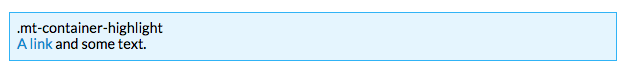
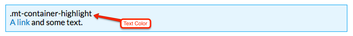
Highlight containers
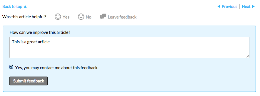
The most colorful of the CXone Expert Responsive containers, highlight containers are used to bring focus to certain functionalities. They can be found in the global navigation bar, the article feedback form, and information status messages.
Variables
- @highlight-container-background-color
- Default value: lighten(@highlight-color, 37%)
- Definition: Background color of the container.
- @highlight-container-border-color
- Default value: @highlight-color
- Definition: Border color of the container.

- @highlight-container-color
- Default value: @primary-font-color
- Definition: Default text color inside the container.
- @highlight-container-font-family
- Default value: @default-font-family
- Definition: Default font face used in the container. Defaults to
<body>font.
- @highlight-container-link-color
- Default value: @highlight-color
- Definition: The color of links inside the container on page load.
- @highlight-container-link-color-visited
- Default value: @highlight-color
- Definition: The color of links inside the container when a user has previously clicked on it.
- @highlight-container-link-color-hover
- Default value: darken(@highlight-container-link-color, 15%)
- Definition: The color of links inside the container when the user's mouse rolls over it.
- @highlight-container-link-color-active
- Default value: darken(@highlight-container-link-color, 15%)
- Definition: The color of links inside the container when the user clicks on the link, or presses enter after tabbing to it.
- @highlight-container-link-color-focus
- Default value: darken(@highlight-container-link-color, 15%)
- Definition: The color of links inside the container when a user has tabbed to it with a keyboard.
Mixins
.mt-highlight-container {
    background: @highlight-container-background-color;
    border: 1px solid @highlight-container-border-color;
    color: @highlight-container-color;
    font-family: @highlight-container-font-family;
    & a {
        color: @highlight-container-link-color;
        &:visited {
            color: @highlight-container-link-color-visited;
        }
        .no-touch &:hover {
            color: @highlight-container-link-color-hover;
        }
        &:active,
        .no-touch &:active {
            color: @highlight-container-link-color-active;
        }
        &:focus {
            color: @highlight-container-link-color-focus;
        }
    }
}
This is how the above mixin will appear when used in a rule set.
.mt-dashboard-listing-featured {
    .mt-highlight-container;
    border-width: 2px;
    border-radius: @border-radius-lsf;
    .flexbox-listing(2; 1; 100%);
}
CSS class
There is a CSS class selector that can be used to call in the Mixin. You will need to add a class to your HTML for this to work.
// Example of adding the class "mt-container-highlight" to a link in your HTML
<div class="mt-container-highlight">My container content</div>
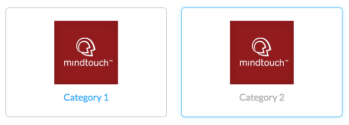
Dynamic listings

Variables
- @dynamic-listing-border-color
- Default value: lighten(@highlight-color-desaturated, 13%)
- Definition: The light grey border that surrounds the sub-page or related page listing.
- @dynamic-listing-border-color-hover
- Default value: @highlight-color
- Definition: The color of the border when a user moves their mouse over it.
- @dynamic-listing-edit-border-color
- Default value: darken(@highlight-color-desaturated, 18%)
- Definition: The dark grey dotted border that appears if the logged in user has edit permissions. Used to designate editable components on a page.
- @dynamic-listing-edit-border-color-hover
- Default value: @highlight-color
- Definition: The color of the border when a user with edit permissions moves their mouse over it.
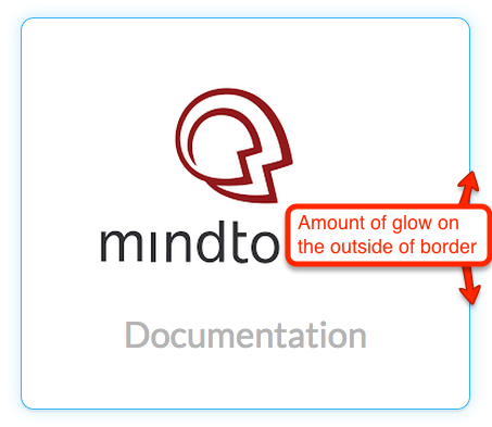
- @dynamic-listing-hover-glow
- Default value: fade(@default-button-border-color-hover, 30%)
- Definition: The color of the glow surrounding the listings when a user moves their mouse over it. The color is based on the site's
@highlight-colorvariable.
Mixins
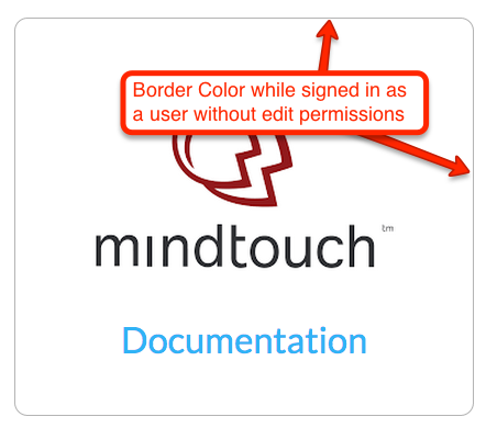
The default dynamic listings style seen by anonymous and community members. The sub-page listing is surrounded by a light grey border with rounded edges.
.flexbox-style {
    border: 1px solid @dynamic-listing-border-color;
    border-radius: @border-radius-lsf;
    box-sizing: border-box;
}
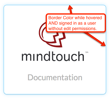
The dynamic listing appearance when a user move their mouse over it. The border turns to the highlight color and a glow based on the highlight color.
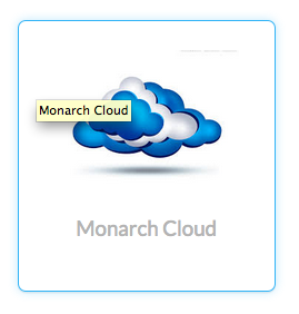
.flexbox-style-hover {
    border-color: @dynamic-listing-border-color-hover;
    box-shadow: 0 .1em 0 rgba(0,0,0,.05), 0 0 .8em @dynamic-listing-hover-glow;
}
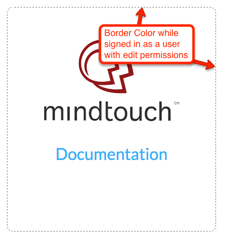
The appearance of the dynamic listing when the user has edit permissions. Editors will see a medium gray dashed border with rounded corners. This design concept is used in multiple locations to designate editor controls. This mixin should not be used on elements that do not have editor only states.
.flexbox-style-edit {
    border: 1px dashed @dynamic-listing-edit-border-color;
    box-sizing: border-box;
}
Mouse over state of the dynamic listing when a user has edit permissions. The hover state is similar to the non-editor view state, just with a dashed border and the appearance of the edit control, if available.
.flexbox-style-edit-hover {
    border-color: @dynamic-listing-edit-border-color-hover;
    box-shadow: 0 .1em 0 rgba(0,0,0,.05), 0 0 .8em @dynamic-listing-hover-glow;
}
The flexbox declarations used with dynamic listings' parent containers. By default, this mixin will align the items by rows, with child elements that will align to fit in the parent container. For more information about flexbox please visit the specification page located at http://dev.w3.org/csswg/css-flexbox.
.display-flex {
    .ms-flex-display;
    .webkit-flex-display;
    align-content: flex-start;
    align-items: stretch;
    display: -ms-flexbox;
    display: -webkit-flex;
    display: flex;
    flex-direction: row;
    flex-wrap: wrap;
    justify-content: flex-start;
}
Internet Explorer 10+ vendor prefixes for flexbox styles. These declarations are the same as the ones in .display-flex.
.ms-flex-display {
    -ms-flex-line-pack: start;
    -ms-flex-align: stretch;
    -ms-flex-direction: row;
    -ms-flex-wrap: wrap;
    -ms-flex-pack: start;
}
Safari vendor prefixes for flexbox styles. These declarations are the same as the ones in .display-flex.
.webkit-flex-display {
    -webkit-flex-line-pack: flex-start;
    -webkit-flex-align: stretch;
    -webkit-flex-direction: row;
    -webkit-flex-wrap: wrap;
    -webkit-flex-pack: flex-start;
}
Individual listings flexbox controls. The values that this mixin contains have to do with the CSS3 specification for flexbox (CSS Flexible Box Layout) and require an advanced knowledge of CSS.
// @flex-grow: Defines the amount of available space inside the parent container the listing should take up.
// @flex-shrink: Specifies how the listing will shrink relative to the rest of the other listings inside the same parent container.
// @flex-basis: Sets the initial size of the listing, before any available space is distributed inside the parent container.

.flexbox-listing(@flex-grow: 1; @flex-shrink: 1; @flex-basis: 18em) {
    -ms-flex: @flex-grow @flex-shrink @flex-basis;
    -webkit-flex: @flex-grow @flex-shrink @flex-basis;
    flex: @flex-grow @flex-shrink @flex-basis;
    min-width: 0;
}
Here is an example of how this would look as a declaration in a rule set.
.mt-sortable-listing {
    .flexbox-style;
    .flexbox-listing(1; 1; 18em);
    margin: 1em;
    text-align: center;
}